CheckoutWithCard
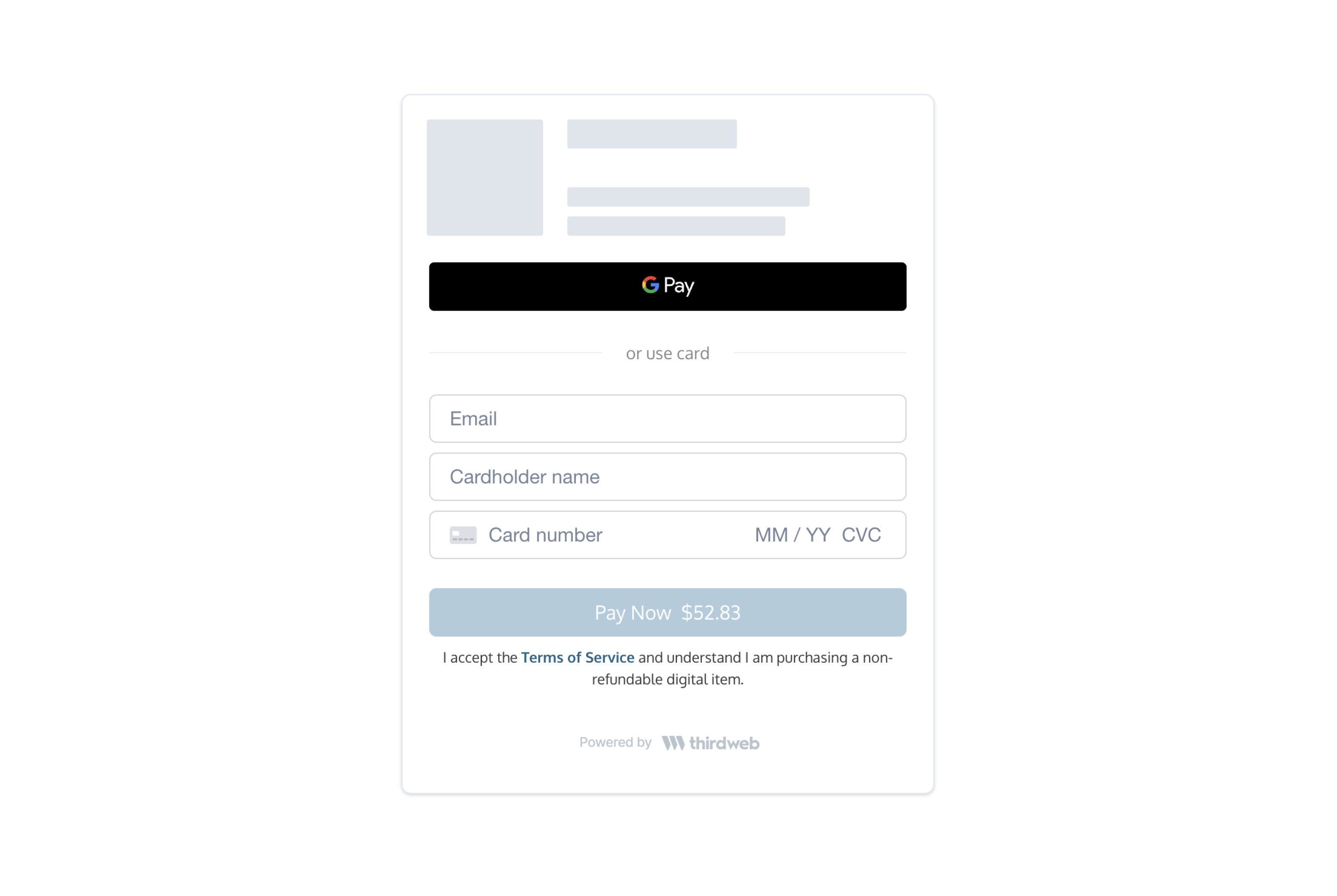
The CheckoutWithCard element embeds a form on your app that accepts credit/debit card, Apple Pay, and Google Pay.
This component also handles:
- Apple Pay and Google Pay
- Bot and anti-fraud detection
- 3D Secure (if necessary)
- Buyer KYC (if necessary)
Demo
React Integration
- Install the React SDK (Install guide):
npm install @thirdweb-dev/reactyarn add @thirdweb-dev/react - On your frontend, render the
CheckoutWithCardcomponent with your configs.
Example code
import { CheckoutWithCard } from "@thirdweb-dev/react";

<CheckoutWithCard
  clientId="YOUR_CLIENT_ID"
  configs={{
    // Registered contract ID
    contractId: "YOUR_CONTRACT_ID",
    // Buyer wallet address
    walletAddress: "0x...",
    // Mint method (for custom contracts only)
    mintMethod: {
      name: "claimTo",
      args: {
        _to: "$WALLET",
        _quantity: "$QUANTITY",
        _tokenId: 0,
      },
      payment: {
        value: "0.1 * $QUANTITY",
        currency: "ETH",
      },
    },
    // contractArgs (for prebuilt contracts)
    contractArgs: {
      tokenId: 0,
    },
  }}
  onPaymentSuccess={(result) => {
    console.log("Payment successful:", result);
  }}
/>
CheckoutWithCard props
| Name | Type | Description |
|---|---|---|
| clientId * | string | thirdweb client ID (Obtained from an API key which you can generate on the Dashboard) |
| configs * | object | A list of configs to create your card checkout element. Fields correspond to those in the Create Checkout Elements Client Secret API. |
| Additional Contract Resources: | ||
| - Custom Contracts: Refer to Custom Contracts Guide for integration details. | ||
| - Pre-built Contracts: For using pre-built contracts, see Pre-built Contracts Information. | ||
| onPaymentSuccess * | ({ transactionId: string; }) => void | This method is called after the payment has been submitted for processing. This payment may still be rejected by the cardholder's bank. |
| onError | (PaymentsSDKError) => void | This method is called when an error is encountered. |
| onPriceUpdate | ({ quantity: number; unitPrice: PriceDetail; networkFees: PriceDetail; serviceFees: PriceDetail; total: PriceDetail; }) => void | This method is called when the price is updated or loaded for the first time. This summary is helpful to show a granular price breakdown. Where PriceDetail is { display: string; valueInSubunits: number; currency: string; } |
| locale | enum Valid values: en, fr, es, it, de, ja, ko, zh | The language to show text in. Defaults to en. |
| options | object | Customize component styling. See Customization. |
Javascript Integration
- Install the Javascript SDK:
npm install @thirdweb-dev/paymentsyarn add @thirdweb-dev/payments - Call
createCheckoutWithCardElementwithconfigsto insert the iframe on your page into a new or existing element.- If you don't provide
elementOrId, this call returns an iframe element for you to insert into your page.
- If you don't provide
Example code
import { createCheckoutWithCardElement } from "@thirdweb-dev/payments";

// Assume a container exists:
//
//      <div id="paper-checkout-container" width="380px" />
//
createCheckoutWithCardElement({
  clientId: "YOUR_CLIENT_ID",
  configs: {
    contractId: "YOUR_CONTRACT_ID",
    walletAddress: "0x...",
    // Mint method (for custom contracts only)
    mintMethod: {
      name: "claimTo",
      args: {
        _to: "$WALLET",
        _quantity: "$QUANTITY",
        _tokenId: 0,
      },
      payment: {
        value: "0.1 * $QUANTITY",
        currency: "ETH",
      },
    },
    // contractArgs (for prebuilt contracts)
    contractArgs: {
      tokenId: 0,
    },
  },
  elementOrId: "paper-checkout-container",
  appName: "My Web3 App",
  options: {
    colorPrimary: "#cf3781",
  },
  onError(error) {
    console.error("Payment error:", error);
  },
  onPaymentSuccess({ id }) {
    console.log("Payment successful.");
  },
});

// Alternatively, insert the iframe programmatically:
//
//      const iframe = createCheckoutWithCardElement(...)
//      document.getElementById('paper-checkout-container').appendChild(iframe);
createCheckoutWithCardElement Parameters
| Name | Type | Description |
|---|---|---|
| clientId * | string | thirdweb client ID (Obtained from an API key which you can generate on the Dashboard) |
| configs * | object | A list of configs to create your card checkout element. Fields correspond to those in the Create Checkout Elements Client Secret API. |
| Additional Contract Resources: | ||
| - Custom Contracts: Refer to Custom Contracts Guide for integration details. | ||
| - Pre-built Contracts: For using pre-built contracts, see Pre-built Contracts Information. | ||
| elementOrId | string | HTMLElement | If provided, the iframe will be appended to this element. You can pass in the DOM element or the id associated with the element. A minimum width of 380px is recommended. |
| appName | string | If provided, the wallet card will display your appName. |
| locale | enum (Valid values: en, fr, es, it, de, ja, ko, zh) | The language to show text in. Defaults to en. |
| options | object | Customize component styling. See Customization. |
| onLoad | () => void | This method is called when the iframe loads. |
| onError | (error: PaymentsSDKError) => void | This method is called when an error occurs during the payment process. |
| onPaymentSuccess | (props: { transactionId: string }) => void | This method is called when the buyer has successfully paid. |
| onReview | (props: { cardholderName: string, id: string }) => void | This method is called after the user enters their card details. |
Customization
The optional options argument allows you to customize the component's styling. All customization fields are optional.
options object
| Name | Type | Description |
|---|---|---|
| colorPrimary | string (In hex, e.g. #cf3781) | The primary brand color for buttons and links. |
| colorBackground | string (In hex, e.g. #cf3781) | The background color of the page. |
| colorText | string (In hex, e.g. #cf3781) | The color for text on the page and UI elements. |
| borderRadius | number (In px, e.g. 0 for sharp corners, 12 for rounded corners, 24 for pill shape) | The roundness of buttons and input elements. |
| inputBorderColor | string (In hex, e.g. #cf3781) | The border color of the input field. |
| inputBackgroundColor | string (In hex, e.g. #cf3781) | The background color of the input field. |
Examples
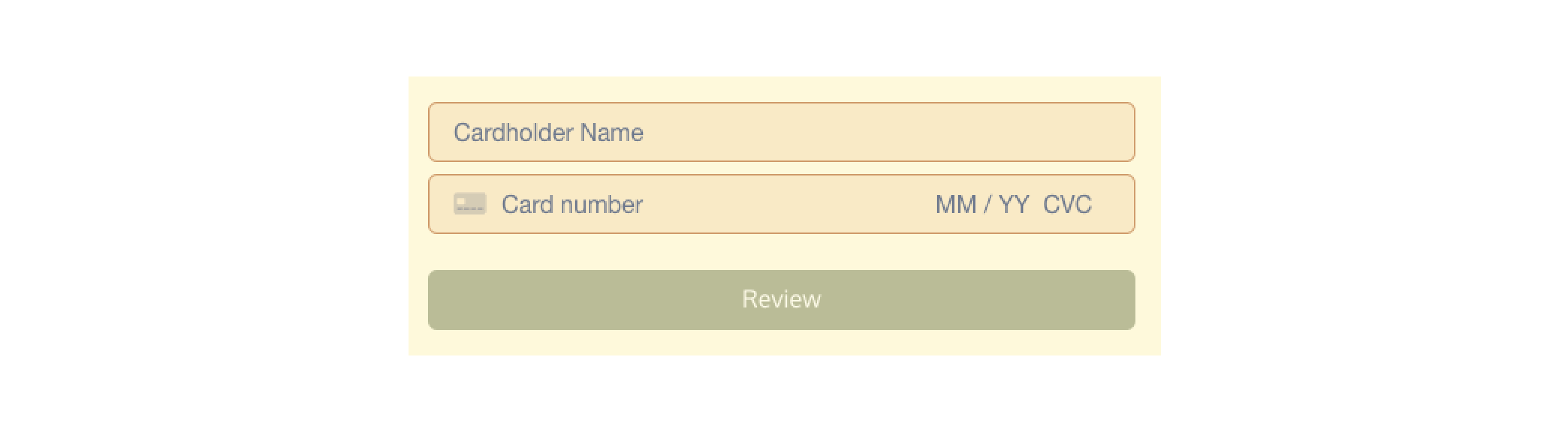
Here's an example component with the following options arguments:
{
    colorBackground: '#fefae0',
    colorPrimary: '#606c38',
    colorText: '#283618',
    borderRadius: 6,
    inputBackgroundColor: '#faedcd',
    inputBorderColor: '#d4a373',
}
Important Notes
How do I prevent the 3D Secure or KYC modal from popping up behind my other frontend components?
The SDK uses a z-index of 10000 for these modals. If they are appearing behind other components, please lower your other components' z-index values.